Agent Chat with Multimodal Models: LLaVA
![]()
This notebook uses LLaVA as an example for the multimodal feature. More information about LLaVA can be found in their GitHub page
This notebook contains the following information and examples:
- Setup LLaVA Model
- Option 1: Use API calls from
Replicate - Option 2: Setup LLaVA locally (requires GPU)
- Option 1: Use API calls from
- Application 1: Image Chat
- Application 2: Figure Creator
Before everything starts, install AutoGen with the lmm option
pip install "autogen[lmm]>=0.3.0"
# We use this variable to control where you want to host LLaVA, locally or remotely?
# More details in the two setup options below.
import json
import os
import random
import time
from typing import Any, Callable, Dict, List, Optional, Tuple, Type, Union

import matplotlib.pyplot as plt
import requests
from PIL import Image
from termcolor import colored

import autogen
from autogen import Agent, AssistantAgent, ConversableAgent, UserProxyAgent
from autogen.agentchat.contrib.llava_agent import LLaVAAgent, llava_call

LLAVA_MODE = "remote"  # Either "local" or "remote"
assert LLAVA_MODE in ["local", "remote"]
## (Option 1, preferred) Use API Calls from Replicate [Remote] We can also use Replicate to use LLaVA directly, which will host the model for you.
- Run
pip install replicateto install the package - You need to get an API key from Replicate from your account setting page
- Next, copy your API token and authenticate by setting it as an
environment variable:
export REPLICATE_API_TOKEN=<paste-your-token-here> - You need to enter your credit card information for Replicate 🥲
# pip install replicate
# import os
## alternatively, you can put your API key here for the environment variable.
# os.environ["REPLICATE_API_TOKEN"] = "r8_xyz your api key goes here~"
if LLAVA_MODE == "remote":
    import replicate

    llava_config_list = [
        {
            "model": "whatever, will be ignored for remote",  # The model name doesn't matter here right now.
            "api_key": "None",  # Note that you have to setup the API key with os.environ["REPLICATE_API_TOKEN"]
            "base_url": "yorickvp/llava-13b:2facb4a474a0462c15041b78b1ad70952ea46b5ec6ad29583c0b29dbd4249591",
        }
    ]
## [Option 2] Setup LLaVA Locally
Install the LLaVA library
Please follow the LLaVA GitHub page to install LLaVA.
Download the package
git clone https://github.com/haotian-liu/LLaVA.git
cd LLaVA
Install the inference package
conda create -n llava python=3.10 -y
conda activate llava
pip install --upgrade pip  # enable PEP 660 support
pip install -e .
Some helpful packages and dependencies:
conda install -c nvidia cuda-toolkit
Launch
In one terminal, start the controller first:
python -m llava.serve.controller --host 0.0.0.0 --port 10000
Then, in another terminal, start the worker, which will load the model to the GPU:
python -m llava.serve.model_worker --host 0.0.0.0 --controller http://localhost:10000 --port 40000 --worker http://localhost:40000 --model-path liuhaotian/llava-v1.5-13b
``

::: {.cell execution_count=5}
``` {.python .cell-code}
# Run this code block only if you want to run LlaVA locally
if LLAVA_MODE == "local":
    llava_config_list = [
        {
            "model": "llava-v1.5-13b",
            "api_key": "None",
            "base_url": "http://0.0.0.0:10000",
        }
    ]
:::
Multimodal Functions
We cal test the llava_call function with the following AutoGen image.

rst = llava_call(
    "Describe this AutoGen framework <img https://raw.githubusercontent.com/microsoft/autogen/main/website/static/img/autogen_agentchat.png> with bullet points.",
    llm_config={"config_list": llava_config_list, "temperature": 0},
)

print(rst)
The AutoGen framework is a tool for creating and managing conversational agents. It allows for the creation of multiple-agent conversations, enabling complex interactions between different agents. The framework is designed to be flexible and scalable, allowing for the addition of new agents and conversations as needed.

The framework consists of three main components:

1. Agents: These are the individual conversational entities that can be created and managed within the framework. Each agent has its own unique set of conversational capabilities and can engage in conversations with other agents.

2. Conversations: These are the interactions between agents, which can be managed and directed by the framework. Conversations can be structured and organized to facilitate efficient communication between agents.

3. Flexibility: The framework is designed to be flexible, allowing for the addition of new agents and conversations as needed. This flexibility enables the framework to adapt to changing requirements and facilitate the development of more complex conversational systems.
In this section, we present a straightforward dual-agent architecture to enable user to chat with a multimodal agent.
First, we show this image and ask a question.
Within the user proxy agent, we can decide to activate the human input mode or not (for here, we use human_input_mode=“NEVER” for conciseness). This allows you to interact with LLaVA in a multi-round dialogue, enabling you to provide feedback as the conversation unfolds.
image_agent = LLaVAAgent(
    name="image-explainer",
    max_consecutive_auto_reply=10,
    llm_config={"config_list": llava_config_list, "temperature": 0.5, "max_new_tokens": 1000},
)

user_proxy = autogen.UserProxyAgent(
    name="User_proxy",
    system_message="A human admin.",
    code_execution_config={
        "last_n_messages": 3,
        "work_dir": "groupchat",
        "use_docker": False,
    },  # Please set use_docker=True if docker is available to run the generated code. Using docker is safer than running the generated code directly.
    human_input_mode="NEVER",  # Try between ALWAYS or NEVER
    max_consecutive_auto_reply=0,
)

# Ask the question with an image
user_proxy.initiate_chat(
    image_agent,
    message="""What's the breed of this dog?
<img https://th.bing.com/th/id/R.422068ce8af4e15b0634fe2540adea7a?rik=y4OcXBE%2fqutDOw&pid=ImgRaw&r=0>.""",
)
What's the breed of this dog?
<image>.
--------------------------------------------------------------------------------
>>>>>>>> USING AUTO REPLY...
You are an AI agent and you can view images.
###Human: What's the breed of this dog?
<image>.
###Assistant:
The breed of the dog in the image is a poodle.
--------------------------------------------------------------------------------
Now, input another image, and ask a followup question.
# Ask the question with an image
user_proxy.send(
    message="""What is this breed?
<img https://th.bing.com/th/id/OIP.29Mi2kJmcHHyQVGe_0NG7QHaEo?pid=ImgDet&rs=1>

Among the breeds, which one barks less?""",
    recipient=image_agent,
)
What is this breed?
<image>
Among the breeds, which one barks less?
--------------------------------------------------------------------------------
>>>>>>>> USING AUTO REPLY...
You are an AI agent and you can view images.
###Human: What's the breed of this dog?
<image>.
###Assistant: The breed of the dog in the image is a poodle.
###Human: What is this breed?
<image>
Among the breeds, which one barks less?
###Assistant:
Among the breeds, poodles tend to bark less compared to other breeds. However, it is important to note that individual dogs may have different temperaments and barking habits, regardless of their breed.
--------------------------------------------------------------------------------
## Application 2: Figure Creator
Here, we define a FigureCreator agent, which contains three child
agents: commander, coder, and critics.
- Commander: interacts with users, runs code, and coordinates the flow between the coder and critics.
- Coder: writes code for visualization.
- Critics: LLaVA-based agent that provides comments and feedback on the generated image.
class FigureCreator(AssistantAgent):
    def __init__(self, n_iters=2, **kwargs):
        """
        Initializes a FigureCreator instance.

        This agent facilitates the creation of visualizations through a collaborative effort among its child agents: commander, coder, and critics.

        Parameters:
            - n_iters (int, optional): The number of "improvement" iterations to run. Defaults to 2.
            - **kwargs: keyword arguments for the parent AssistantAgent.
        """
        super().__init__(**kwargs)
        self.register_reply([Agent, None], reply_func=FigureCreator._reply_user, position=0)
        self._n_iters = n_iters

    def _reply_user(self, messages=None, sender=None, config=None):
        if all((messages is None, sender is None)):
            error_msg = f"Either {messages=} or {sender=} must be provided."
            logger.error(error_msg)  # noqa: F821
            raise AssertionError(error_msg)

        if messages is None:
            messages = self._oai_messages[sender]

        user_question = messages[-1]["content"]

        ### Define the agents
        commander = AssistantAgent(
            name="Commander",
            human_input_mode="NEVER",
            max_consecutive_auto_reply=10,
            system_message="Help me run the code, and tell other agents it is in the <img result.jpg> file location.",
            is_termination_msg=lambda x: x.get("content", "").rstrip().endswith("TERMINATE"),
            code_execution_config={
                "last_n_messages": 3,
                "work_dir": ".",
                "use_docker": False,
            },  # Please set use_docker=True if docker is available to run the generated code. Using docker is safer than running the generated code directly.
            llm_config=self.llm_config,
        )

        critics = LLaVAAgent(
            name="Critics",
            system_message="""Criticize the input figure. How to replot the figure so it will be better? Find bugs and issues for the figure.
            Pay attention to the color, format, and presentation. Keep in mind of the reader-friendliness.
            If you think the figures is good enough, then simply say NO_ISSUES""",
            llm_config={"config_list": llava_config_list},
            human_input_mode="NEVER",
            max_consecutive_auto_reply=1,
            #     use_docker=False,
        )

        coder = AssistantAgent(
            name="Coder",
            llm_config=self.llm_config,
        )

        coder.update_system_message(
            coder.system_message
            + "ALWAYS save the figure in `result.jpg` file. Tell other agents it is in the <img result.jpg> file location."
        )

        # Data flow begins
        commander.initiate_chat(coder, message=user_question)
        img = Image.open("result.jpg")
        plt.imshow(img)
        plt.axis("off")  # Hide the axes
        plt.show()

        for i in range(self._n_iters):
            commander.send(message="Improve <img result.jpg>", recipient=critics, request_reply=True)

            feedback = commander._oai_messages[critics][-1]["content"]
            if feedback.find("NO_ISSUES") >= 0:
                break
            commander.send(
                message="Here is the feedback to your figure. Please improve! Save the result to `result.jpg`\n"
                + feedback,
                recipient=coder,
                request_reply=True,
            )
            img = Image.open("result.jpg")
            plt.imshow(img)
            plt.axis("off")  # Hide the axes
            plt.show()

        return True, "result.jpg"
config_list_gpt4 = autogen.config_list_from_json(
    "OAI_CONFIG_LIST",
    filter_dict={
        "model": ["gpt-4", "gpt-4-0314", "gpt4", "gpt-4-32k", "gpt-4-32k-0314", "gpt-4-32k-v0314"],
    },
)

gpt4_llm_config = {"config_list": config_list_gpt4, "cache_seed": 42}

# config_list_gpt35 = autogen.config_list_from_json(
#     "OAI_CONFIG_LIST",
#     filter_dict={
#         "model": ["gpt-35-turbo", "gpt-3.5-turbo"],
#     },
# )

# gpt35_llm_config = {"config_list": config_list_gpt35, "cache_seed": 42}


creator = FigureCreator(name="Figure Creator~", llm_config=gpt4_llm_config)

user_proxy = autogen.UserProxyAgent(
    name="User", human_input_mode="NEVER", max_consecutive_auto_reply=0, code_execution_config={"use_docker": False}
)  # Please set use_docker=True if docker is available to run the generated code. Using docker is safer than running the generated code directly.

user_proxy.initiate_chat(
    creator,
    message="""
Plot a figure by using the data from:
https://raw.githubusercontent.com/vega/vega/main/docs/data/seattle-weather.csv

I want to show both temperature high and low.
""",
)
User (to Figure Creator~):
Plot a figure by using the data from:
https://raw.githubusercontent.com/vega/vega/main/docs/data/seattle-weather.csv
I want to show both temperature high and low.
--------------------------------------------------------------------------------
Plot a figure by using the data from:
https://raw.githubusercontent.com/vega/vega/main/docs/data/seattle-weather.csv
I want to show both temperature high and low.
--------------------------------------------------------------------------------
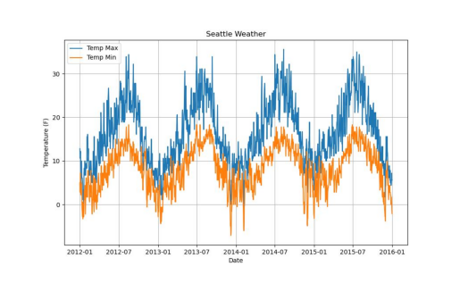
First, we will download the CSV file, then we will parse it using pandas, a popular data analysis library in Python. After that, we will plot the data using matplotlib.
This is how we could do this:
```python
import pandas as pd
import matplotlib.pyplot as plt
# Step 1: Load the Data
url = "https://raw.githubusercontent.com/vega/vega/main/docs/data/seattle-weather.csv"
data = pd.read_csv(url)
# Step 2: Parse the date to datetime format
data['date'] = pd.to_datetime(data['date'])
# Step 3: Plot the Data
plt.figure(figsize=(10,6))
plt.plot(data['date'], data['temp_max'], label='Temp Max')
plt.plot(data['date'], data['temp_min'], label='Temp Min')
plt.title('Seattle Weather')
plt.xlabel('Date')
plt.ylabel('Temperature (F)')
plt.legend()
plt.grid()
# Save the figure
plt.savefig('result.jpg')
# Display the plot
plt.show()
```
When you run this code, it will load the data from the given URL, parse the 'date' column to datetime format, then plot the "temp_max" and "temp_min" over time. The resulting plot is then shown to you. The plot will automatically be saved as 'result.jpg' in the current directory. I will also submit these instructions to other agents.
--------------------------------------------------------------------------------
>>>>>>>> EXECUTING CODE BLOCK 0 (inferred language is python)...
exitcode: 0 (execution succeeded)
Code output:
Figure(1000x600)
--------------------------------------------------------------------------------
Great! The code has successfully executed and the plot was generated and saved as `result.jpg`.
If you check the working directory, you should find the figure saved as `result.jpg`.
Let me know if you need help with anything else.
TERMINATE
--------------------------------------------------------------------------------
Improve <image>
--------------------------------------------------------------------------------
Criticize the input figure. How to replot the figure so it will be better? Find bugs and issues for the figure.
Pay attention to the color, format, and presentation. Keep in mind of the reader-friendliness.
If you think the figures is good enough, then simply say NO_ISSUES
###Human: Improve <image>
###Assistant:
The input figure shows a graph of Seattle weather, with a blue line representing the temperature and an orange line representing the humidity. The graph is displayed on a white background, with the title "Seattle Weather" at the top.
There are a few issues with the figure that could be improved:
1. The color scheme for the temperature and humidity lines is not clear. The blue line represents the temperature, but it is not immediately clear to the viewer. A more distinct color or labeling could help clarify this.
2. The graph does not have any axis labels or units, making it difficult for the viewer to understand the scale and units of the temperature and humidity values.
3. The graph is not well-organized, with the temperature and humidity lines overlapping and not clearly separated. A more organized layout could help the viewer better understand the relationship between the two variables.
To improve the figure, the following changes could be made:
1. Use a more distinct color for the temperature line, such as red, and label it with a clear title, such as "Temperature (°C)".
2. Add axis labels for both the temperature and humidity lines, indicating the units and scale of the values.
3. Separate the temperature and humidity lines, either by using different colors or by adding a clear separation between them.
4. Consider adding a legend or key to help the viewer understand the meaning of the different colors and lines on the graph.
By making these changes, the figure will be more reader-friendly and easier to understand.
--------------------------------------------------------------------------------
Here is the feedback to your figure. Please improve! Save the result to `result.jpg`
The input figure shows a graph of Seattle weather, with a blue line representing the temperature and an orange line representing the humidity. The graph is displayed on a white background, with the title "Seattle Weather" at the top.
There are a few issues with the figure that could be improved:
1. The color scheme for the temperature and humidity lines is not clear. The blue line represents the temperature, but it is not immediately clear to the viewer. A more distinct color or labeling could help clarify this.
2. The graph does not have any axis labels or units, making it difficult for the viewer to understand the scale and units of the temperature and humidity values.
3. The graph is not well-organized, with the temperature and humidity lines overlapping and not clearly separated. A more organized layout could help the viewer better understand the relationship between the two variables.
To improve the figure, the following changes could be made:
1. Use a more distinct color for the temperature line, such as red, and label it with a clear title, such as "Temperature (°C)".
2. Add axis labels for both the temperature and humidity lines, indicating the units and scale of the values.
3. Separate the temperature and humidity lines, either by using different colors or by adding a clear separation between them.
4. Consider adding a legend or key to help the viewer understand the meaning of the different colors and lines on the graph.
By making these changes, the figure will be more reader-friendly and easier to understand.
--------------------------------------------------------------------------------
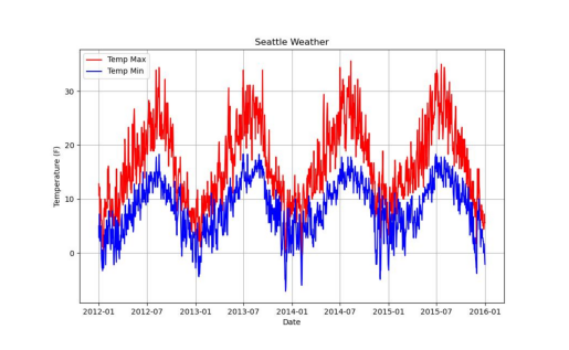
Thank you for your feedback. I will indeed make the improvements accordingly. This time, each graph line will be labeled showing which indicates "Temp Max" and which indicates "Temp Min". I will also assign a red color to the line representing "Temp Max" and a blue color to the line representing "Temp Min". I will make sure the axes have the appropriate labels.
Follow this code and it will improve your figure and saved as `result.jpg`:
```python
import pandas as pd
import matplotlib.pyplot as plt
# Step 1: Load the Data
url = "https://raw.githubusercontent.com/vega/vega/main/docs/data/seattle-weather.csv"
data = pd.read_csv(url)
# Step 2: Parse the date to datetime format
data['date'] = pd.to_datetime(data['date'])
# Step 3: Plot the Data
plt.figure(figsize=(10,6))
plt.plot(data['date'], data['temp_max'], color='red', label='Temp Max')
plt.plot(data['date'], data['temp_min'], color='blue', label='Temp Min')
plt.title('Seattle Weather')
plt.xlabel('Date')
plt.ylabel('Temperature (F)')
plt.legend()
plt.grid()
# Save the figure
plt.savefig('result.jpg')
# Display the plot
plt.show()
```
This code improves upon the previous one by adding distinct colors for the temperature max and min lines (red and blue, respectively), labeling each line, and providing proper axes labels. The result will be a plot that is more reader-friendly and easier to understand. The plot will automatically be saved as 'result.jpg' in the current directory. I will also submit these instructions to other agents.
--------------------------------------------------------------------------------
>>>>>>>> EXECUTING CODE BLOCK 0 (inferred language is python)...
exitcode: 0 (execution succeeded)
Code output:
Figure(1000x600)
--------------------------------------------------------------------------------
Great, the code has been successfully executed and the updates have been made based on the feedback.
You should now have a more reader-friendly plot, with clear distinction between maximum and minimum temperatures, and more evident axis labels. This updated figure is saved as `result.jpg` in your current directory.
If you need further improvements or need assistance with something else, feel free to ask.
TERMINATE
--------------------------------------------------------------------------------
Improve <image>
--------------------------------------------------------------------------------
Here is the feedback to your figure. Please improve! Save the result to `result.jpg`
Improve <img result.jpg>
--------------------------------------------------------------------------------
I apologize for the misunderstanding, but without more specific feedback about the figure, it's difficult to understand what improvements are needed. As of now, the figure includes distinct colors for max and min temperatures, clear labeling of lines, and proper axis labels.
However, if you want to improve visual clarity, you can try:
- Changing the line style (making one of them dotted, for instance).
- Adding a title to the legend for better clarification.
- Changing the figure size for a improved view.
Here is the modified code:
```python
import pandas as pd
import matplotlib.pyplot as plt
# Step 1: Load the Data
url = "https://raw.githubusercontent.com/vega/vega/main/docs/data/seattle-weather.csv"
data = pd.read_csv(url)
# Step 2: Parse the date to datetime format
data['date'] = pd.to_datetime(data['date'])
# Step 3: Plot the Data
plt.figure(figsize=(12,8))
plt.plot(data['date'], data['temp_max'], 'r-', label='Temp Max')
plt.plot(data['date'], data['temp_min'], 'b--', label='Temp Min')
plt.title('Seattle Weather')
plt.xlabel('Date')
plt.ylabel('Temperature (F)')
plt.legend(title='Temperature')
plt.grid()
# Save the figure
plt.savefig('result.jpg')
# Display the plot
plt.show()
```
This code changes the line style for the min temperature to dots for better distinction. Adjusts the figure size for a better representation and adds a title to the legend. The plot will automatically be saved as 'result.jpg' in the current directory. You are encouraged to run this code and I will also submit these instructions to other agents.
--------------------------------------------------------------------------------
>>>>>>>> EXECUTING CODE BLOCK 0 (inferred language is python)...
exitcode: 0 (execution succeeded)
Code output:
Figure(1200x800)
--------------------------------------------------------------------------------
Great! The code has successfully executed and the plot was generated and saved as `result.jpg`. The figure now includes distinct colors for max and min temperatures, different line styles, and a clearer legend.
You will find the figure saved as 'result.jpg' in your current directory.
If you need any further improvements or other assistance, please let me know.
TERMINATE
--------------------------------------------------------------------------------
Figure Creator~ (to User):
result.jpg
--------------------------------------------------------------------------------
if os.path.exists("result.jpg"):
    os.remove("result.jpg")  # clean up